Friday, October 23, 2009

Scopitone Videos

This week we were provided with a brief history of music videos and introduced to the scopitone, a jukebox-like device from the 60s that music videos were originally made for. By comparing the 1960’s music videos made for the scopitone with those from today, one can observe just how far music videos have come from their 1960s scopitone counterparts.

After doing a search for scopitone videos on Youtube and watching a variety of these search results, I’ve realized that the scopitone videos from the 60’s are all very similar in style to one another. Being use to such a wide range of video styles and techniques used in modern day music videos, I found the lack of variety and style to be quite boring and repetitive, but amusing nonetheless.

Watching these videos from the 60’s must be done with a grain of salt. Being so use to the advanced technology, special effects and expensive budgets that make up most of today’s videos, films from the 60’s appear to be very basic and boring.

Although videos in the 60s were made with smaller budgets, and less technology, I feel that they were lacking in many other elements that could have made them more dynamic. The camera work in the scopitone videos was very simplistic. Pans, tilts, and zooms were often utilized within the scopitones; however, they lacked any dynamic camera work such as extreme angles, canters, as well as any crane or dolly shots. The scopitones often had long drawn out shots, requiring minimal editing, while many contemporary videos are quick paced with shots lasting only a second or so before the angle is changed. Lighting and tone were also fairly consistent throughout the scopitones. The singers always seem to be cheery and smiling, and surrounded by high key lighting. Today a wide variety of feelings and emotions are portrayed through music videos, effectively using differing lighting techniques to bring these emotions across.

The sets and props used within the videos from the 60’s were very simplistic as well, and often gave the setting a very stage-like feel. The props and sets, along with the actions of the people on screen often directly reflected what was being sung about. For example, in Joi Lansing’s “Web of Love,” as the lyrics: “I was game and you took aim and struck me through my heart,” are sung, a dart strikes a giant heart being worn by Lansing. While singing the lyrics: “trapped in a web of love,” Lansing dances while tangled in a giant spider web. Contemporary videos, on the other hand, are often a lot more visually figurative and artistic.

Cheesy dances performed by beautiful girls in skimpy bathing suits were a recurring element of the scopitone videos that I watched. The dances were very simplistic and their performances didn’t seem to require a lot of skill. The dances performed in music videos today tend to be more advanced and require a decent amount of skill and talent, although this is not always the case (sorry Fat Joe).

Watching these 1960’s scopitone videos from a 21st century perspective, and being so accustomed to the videos of today, it was very difficult for me to appreciate and take these videos seriously. I do realize, however, that these videos were probably very innovative for their time, and that they are the roots from which today’s music videos have evolved.

Tuesday, October 13, 2009

Animation Interactive Inspiration

For my animation interactive assignment I want to tell a short interactive children’s story about a hungry boy who makes himself a sandwich. There will be multiple buttons throughout the story that allow the viewer to interact and help the main character choose ingredients as he searches through his fridge, and then builds his sandwich one layer at a time.

My inspiration for this idea came from a variety of sources. Last week in the digital media lecture, choose your own adventure novels were briefly mentioned as we discussed different forms of interactive media. I contemplated making my animation interactive a short story that had many buttons throughout it, rather than just one at the beginning. I originally imagined giving my audience multiple buttons that they could choose between that would result in differing outcomes in the story. I quickly realized that the execution of this would be complicated and above my skill level so I decided to simplify my idea.

I’m uncertain at the moment as to whether I will draw my images using the tools in Flash, or hand draw then scan my images onto the computer, but either way I expect my animation to have a cartoony, childish look. I decided to aim my animation towards children because I feel that I would be able to initiate this style the best. With this target audience in mind I decided to make my story simple, straightforward, and lighthearted. I also feel that the large amount of interaction within my story will keep younger kids interested and engaged while watching it.

After comparing my ideas to already existing media, I’ve decided that my story is reminiscent of many simple children computer games from my childhood. My idea also reminds me of a Dora the Explorer episode I saw once. Dora needed something from her backpack, and the entire contents of her backpack floated out onto the screen. She asked the audience what she should choose, and then a mouse icon come and clicked the correct item (as if the viewer at home were making this decision). Like this episode, my story will create the illusion that the viewer is making choices for the main character as he makes his sandwich, when in reality there will only ever be one button available at a time.

I feel that the Flash tutorials have provided me with enough knowledge to let me to go though with my idea; however I don’t yet have experience importing and working with images from outside of Flash (ex. hand drawn images) although I have a feeling that this task will be fairly straight forward if I choose to go this route. I am still very new and inexperienced with Flash, and I will therefore most likely encounter many obstacles and setbacks during the production of my short story. Through trial and error I hope that I will be able to get past these obstacles, gain confidence using Adobe Flash, and do my short story justice.

Tuesday, October 6, 2009

"Falling Sideways" CD Cover

“Falling Sideways” is an album released by a fictional band called Imperial. Imperial is an indie pop band with a female vocalist who has a sad and pretty voice. The audience I targeted for this album consists of young, artistic adults between the ages of 18-25, as I feel that Imperial’s music would mostly appeal to this demographic.

I chose to use an eye-catching split complementary colour theme for my album, contrasting vibrant orange with blues and purples. The black on the album cover also creates contrast against these bright colours, and provides a base that the bright colourful text of the title can be placed over.

Aside from colour use, I was able to create contrast in my piece by sketching my text to give it a different look than the photographed images used in the rest of the design. Lastly, contrast was created through the disproportionate sizes between the eye and the lips, making the face look very abstract.

I used repetition to bring the album cover together and keep it balanced. By copying and flipping the original image of the sunset on its vertical axis, I was able to create a mirror-like reflection for the background of this design. By isolating the black trees from the colourful sky to its own layer, I was able to duplicate and bring these trees over to the left side of the cover, creating balance and repetition in the design while keeping the viewers eye within the work. Repetition in colour was also utilized, making the falling Xs similar in colour to the orange of the background, and also by making the text for the title: “Falling Sideways” a similar blue to the one used for the lips and the eye.

With proper alignment technique in mind, I made sure to make the black area in my design off center and slightly tilted, as this is where the title would be placed. I felt that the black area would be more aesthetically pleasing if it were to be placed slightly to one side, making the background asymmetrical.

I decided to make my typography kinetic in appearance by making it look as though the letters from the word “falling” were actually falling, and by tilting the word “sideways” sideways. By placing the letters of the words in this way, the meaning behind the words are both visually represented as well as textually, making the viewer see the falling letters before they even get a chance to read the words. I placed the facial features in spots that would utilize the shape of the tree line to create a profile of a face that used the entire sky.

In general, the “Falling Sideways” album cover conveys a girl’s inability to get past something that is causing her too loose control of her life. I associate falling with being out of control. By saying she is falling sideways, it means there’s nothing to hold her to the earth, and there’s nothing to break her fall. Although the tree line mirrors itself in the background, the girl’s face does not, for she is not able to see past the words “falling sideways.” In other words, she is not able to see past the problem that is troubling her. The somber expression on her face conveys these troubled emotions, while the falling Xs represent a crossroads in this girl’s life. Her minimal facial features make it seem as though she is apart of the background, as if she is almost invisible. Her giant closed lips convey just how many things she wants to say and express to the world, but cannot.

I feel that this album would attract young artistic adults between the ages of 18-25 for several reasons. First of all, I feel that the abstract looking, disproportionate face of the girl on the cover catches the viewer’s eye because it is so different and gives the image an overall artistic feel. The vibrant colours that I chose allow the album to stand out as well. I feel that the falling, hand drawn text would also catch the younger viewers eye, as this hand drawn style is currently very popular among younger demographics.

After completing this project, I feel much more comfortable using Photoshop. When I first went in to work on my design, I had a few issues remembering how to apply the things we learned in class to my design, as I was still very new to working with the program. My main issue arouse when I could not remember how to scale images down. Every time I would try to do this, I would accidently change the size of the entire image, rather then just the individual layer that I was working with. I decided to go back and reread the tutorials from the lab class to figure out what I was doing wrong. Once I worked out these sorts of details, I completed my design with relative ease. When I first completed my design, I realized that my image was too cluttered and messy. I then went back and simplified the design by removing images and reorganizing what was left on the page. Finally I was happy with the image I saw, and I can now say that I am pleased with how my design has turned out.

Saturday, October 3, 2009

Typography in Design

This week in class we discussed the importance that typography has on design, and were given the task to find and analyze existing examples of typography. I went searching for examples of designs in which typography was specifically chosen to create a desired effect, and to attract a particular type of viewer. It is amazing just how many designs successfully use typography to convey messages and feelings to its audience.

http://thespectacleblog.wordpress.com/2009/01/31/110/

The first image I chose to analyze is a book cover from R.L. Stine’s Goosebumps HorrorLand Series: “Revenge of the Dummy". The creepy font that is used for the words “Goosebumps” and “HorrorLand” instantly conveys a lot of information to the viewer about the book they are seeing. The oozing, dripping title is reminiscent of blood, telling the viewer that the book falls into the horror genre. This imagery of blood is further developed by the red colour chosen for the word “Goosebumps”. To further this imagery, the texture of the font brings the words into the foreground of the picture, making it look as if the blood is on top of the page.

I feel that this font would really appeal to kids between the ages of 7 – 12 (the recommended age group for these books, and therefore, the target audience). Kids in this age group are very visual, and therefore, the oozing, creepy font on the cover of this book would attract them, and simultaneously tell them that the book is scary. This font is consistent throughout the entire Goosebumps series, conveying that each book within the series is also scary. Although I cannot give the proper name for this font, I can say that I have always referred to it as “The Goosebumps Font,” and have associated it with horror, creepiness, and danger ever since my childhood. The font used on the book covers for R.L. Stine’s “Goosebumps” series is very successful in attracting it’s target audience, and conveying information about the genre they belong to. I’ve always been told not to judge a book by its cover, but clearly you should.

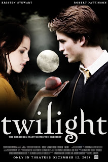
http://www.fanpop.com/spots/twilight-series/images/720496/title/movie-posters

The fancy serif almost calligraphic typeface used for this Twilight movie poster conveys a graceful, fancy, fantasy type of feel that works well with the story around which the movie was based. Twilight is a film depicting a romance between an ordinary girl named Bella, and the perfect Edward Cullen, who also happens to be a vampire. I feel that this movie was mainly targeted towards girls between the ages of 11 and 18, who were the main age group that the books, upon which this film was based, were target towards. I believe that the font used for the title “twilight” on this poster conveys the grace and beauty of both the character Edward Cullen, and the love story that takes place between the two characters. I would say that the white, loopy title also conveys a sort of dreamy, fantasy like feel that reflects the dreaminess of the storyline, and draws in the target audience. I also noticed that the title was written in all lowercase letters. I feel that this was done to further develop the graceful feel of the text, as lowercase letters are less bulky, and tend to flow nicer than uppercase letters.


The font that is used in the background of the album cover of this Austin Powers soundtrack conveys both information about Austin’s character, and the Austin Powers film itself. The typeface used for the words in the background of this cover was very common in the 60s, and is often associated with the hippie movement of that time. This font was chosen because the entire film is based around the humor of bringing a man from the 60’s into the modern day. The 60s vibe that this font gives off is also important in conveying the type of music that can be found on the actual CD, subtly informing the consumer of what they’re about to buy. The chubby font, varying in size and colour, is very lighthearted, fun, and “groovy,” much like Austin’s character, and the Austin Powers film itself. Although the majority of songs on this CD are from the 60s, I feel that the bright, colourful, and fun cover would attract the younger audience that the films also attract, introducing a new generation to the 60s decade and lifestyle.

Overall, it is quite clear to me now just how influential typography can be in a design. A typeface can communicate many things to a viewer, such as genre, mood, and cultural influence, while simultaneously attracting specific demographics. After observing typography used in a variety of successful ways, I now feel that the typography I choose for my poster design will play just as large of a role as the images I put into my design.