This week in class we discussed the importance that typography has on design, and were given the task to find and analyze existing examples of typography. I went searching for examples of designs in which typography was specifically chosen to create a desired effect, and to attract a particular type of viewer. It is amazing just how many designs successfully use typography to convey messages and feelings to its audience.

http://thespectacleblog.wordpress.com/2009/01/31/110/
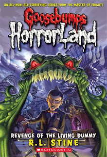
The first image I chose to analyze is a book cover from R.L. Stine’s Goosebumps HorrorLand Series: “Revenge of the Dummy". The creepy font that is used for the words “Goosebumps” and “HorrorLand” instantly conveys a lot of information to the viewer about the book they are seeing. The oozing, dripping title is reminiscent of blood, telling the viewer that the book falls into the horror genre. This imagery of blood is further developed by the red colour chosen for the word “Goosebumps”. To further this imagery, the texture of the font brings the words into the foreground of the picture, making it look as if the blood is on top of the page.
I feel that this font would really appeal to kids between the ages of 7 – 12 (the recommended age group for these books, and therefore, the target audience). Kids in this age group are very visual, and therefore, the oozing, creepy font on the cover of this book would attract them, and simultaneously tell them that the book is scary. This font is consistent throughout the entire Goosebumps series, conveying that each book within the series is also scary. Although I cannot give the proper name for this font, I can say that I have always referred to it as “The Goosebumps Font,” and have associated it with horror, creepiness, and danger ever since my childhood. The font used on the book covers for R.L. Stine’s “Goosebumps” series is very successful in attracting it’s target audience, and conveying information about the genre they belong to. I’ve always been told not to judge a book by its cover, but clearly you should.

http://www.fanpop.com/spots/twilight-series/images/720496/title/movie-posters
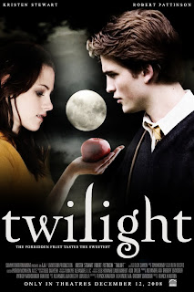
The fancy serif almost calligraphic typeface used for this Twilight movie poster conveys a graceful, fancy, fantasy type of feel that works well with the story around which the movie was based. Twilight is a film depicting a romance between an ordinary girl named Bella, and the perfect Edward Cullen, who also happens to be a vampire. I feel that this movie was mainly targeted towards girls between the ages of 11 and 18, who were the main age group that the books, upon which this film was based, were target towards. I believe that the font used for the title “twilight” on this poster conveys the grace and beauty of both the character Edward Cullen, and the love story that takes place between the two characters. I would say that the white, loopy title also conveys a sort of dreamy, fantasy like feel that reflects the dreaminess of the storyline, and draws in the target audience. I also noticed that the title was written in all lowercase letters. I feel that this was done to further develop the graceful feel of the text, as lowercase letters are less bulky, and tend to flow nicer than uppercase letters.

The font that is used in the background of the album cover of this Austin Powers soundtrack conveys both information about Austin’s character, and the Austin Powers film itself. The typeface used for the words in the background of this cover was very common in the 60s, and is often associated with the hippie movement of that time. This font was chosen because the entire film is based around the humor of bringing a man from the 60’s into the modern day. The 60s vibe that this font gives off is also important in conveying the type of music that can be found on the actual CD, subtly informing the consumer of what they’re about to buy. The chubby font, varying in size and colour, is very lighthearted, fun, and “groovy,” much like Austin’s character, and the Austin Powers film itself. Although the majority of songs on this CD are from the 60s, I feel that the bright, colourful, and fun cover would attract the younger audience that the films also attract, introducing a new generation to the 60s decade and lifestyle.
Overall, it is quite clear to me now just how influential typography can be in a design. A typeface can communicate many things to a viewer, such as genre, mood, and cultural influence, while simultaneously attracting specific demographics. After observing typography used in a variety of successful ways, I now feel that the typography I choose for my poster design will play just as large of a role as the images I put into my design.

No comments:
Post a Comment