Monday, November 30, 2009

Reflections on Course

Having almost completed my BDC 192 course this semester, I have to say that since the beginning of this school year, my knowledge of digital media has really expanded from what it use to be. I found first year digital media to be very informative, helpful, and fun, and I’m glad that it’s one of the mandatory courses for RTA students.

One of the components that made the Digital Media lectures so interesting were the countless examples of web designs, videos, projects, and other neat things that we were shown each week. It was really cool and inspiring to see some of the innovative things that people are doing with digital media these days.

I also found the labs to be very interesting as well. I enjoyed that the majority of the lab period was dedicated to hands on tutorials that allowed us to work within programs and encounter and solve our own problems, rather than just watching the professor at the front of the class. I find that I learn much better when I am doing rather than just watching, and that I hang onto information much better when I have to work to get it.

The programs we were introduced to this semester were all programs that I had heard of before, but had never had the opportunity to use prior to this class. I’m glad that I now have a basic understanding of Photoshop, Flash, and Dreamweaver, even if there is so much for me to still learn about them.

This course has also allowed me to realize just how immersed in digital media the radio and television industry is. Prior to taking this class I probably wouldn't have considered a career in digital media, however I realize now how much this field has to offer. Although I am still very undecided, I’m considering to continue taking digital media courses during the rest of my time at Ryerson.

Whether I continue on in digital media or not, this course has provided me with some very important skills that I can take with me wherever I go. A knowledge of the CRAP principles has allowed me to have a better understanding of how elements within a design should be chosen and organized in order to be aesthetically pleasing, and my new knowledge of the programs we worked with this semester will come in handy in my future studies. The many exciting things going on today in digital media were also very exciting and inspiring to learn about, and I’m glad that I was exposed to so many neat things.

Overall this was a great class and I’m sad to see it end. It was a great learning experience and whether or not I continue on with digital media, I’m glad that I got to take it this semester.

Monday, November 23, 2009

Web 3.0 and LastFM

This week in class we continued our discussion of Web 2.0 from last week, and briefly touch on Web 3.0. For this week’s blog, I wanted to look more into web 3.0, and get a better idea of what the future holds for the Internet.

After doing some research online I found that Web 3.0 will be an “intelligent” and “omnipresent” web that continuously learns from its users in order to anticipate its users likes and dislikes. One website that kept coming up in my searches was LastFM, a music website that recommends music to its users by taking the music that they like, and finding new music for them that other users with similar musical tastes enjoy. This exposes the user to new music, while allowing them to contributed to the database themselves.

I decided to check out LastFM for myself, and see if it really was as great as everyone claimed. After creating an account and adding several bands that I like to my profile I was set up and ready to go. LastFM immediately had a list of recommended artists for me to listen to, many of which I was unfamiliar with. I decided to start off by listening to the station of a band I already knew and liked. Their station did not solely play music from that band, but rather played music that was popular among other fans of the band, which exposed me to a lot of talented artists I had never heard before.

After listening to the first station for a while, I wanted to look more into some of the new bands I had discovered, so I checked out some of their artist pages. On these pages the user can choose and listen to songs by that particular artist, and then add them to their own playlist if they enjoy it. The website also contains stations based on music genres that play songs that have been tagged with that genre by other users.

The user is allowed to like or dislike any song that is played, and tag the tracks with genres. As time goes on, the users profile is more and more geared towards the music that they like, and the site gains a better understanding of the type of music it should recommend for the particular user. This database is completely determined by other users, and is constantly being changed and added too.

I feel that LastFM uses the web in a way that is smart and innovative, as its system allows the website's users to generate the information within the database, which in turn benefits every user by allowing the site to make better music recommendations. I feel that this is the direction the Internet is headed with Web 3.0, and I'm personally very excited to witness more websites that utilize this kind of system in the future.

Tuesday, November 10, 2009

Web 2.0

This week in lecture, we discussed Web 2.0, and the different characteristics that define it. The first characteristic of Web 2.0 we discussed was dynamic content, or the way that sites are constantly being updated. One example of this would be any news website to which news stories are constantly being added and changed. To keep track of the latest content, RSS (Really Simple Syndication) feeds are often used to inform subscribed people of these updates. CBC.ca is one example of a news site that allows users to subscribe to RSS feeds. Some of these feeds include: "Top Stories," "Latest Stories," "World," and "Canada," but these are just a few of many categories, allowing the user to personalize the kind of news that they are subscribing to.

The second characteristic of Web 2.0 that we discussed was user contribution. When I think of user contribution on the web, one example that comes to mind is a website called urbandictionary.com. Urban Dictionary is an online dictionary whose content is written by users from all over the world. Similar to Wikipedia, anyone can submit definitions, which are then edited by volunteers and rated by other users. Urban Dictionary provides the opportunity for people to look up and understand slang terms that would not be present in a formal dictionary. After searching the term “urban dictionary” on urban dictionary, some results included:

Only the coolest semi-fake dictionary ever made... updated by random ppl who usually have a sick mind and quick wit.

A dictionary which can be edited by anybody, so you can find many words that wouldn't be in a normal dictionary. It's mostly used for slang terms.”

“A dictionary where people come to show off their usage and clever definitions of words nobody cares about.”

The third characteristic of Web 2.0 is social media. There are many social networking websites out there these days that allow the user to create and personalize their own profile, and connect with other users. One common form of social networking website is the dating site. Probably one of the most popular dating sites is eHarmony.com, a website on which users can create a profile, and be matched with other people based on a series of questions. It is amazing to know how successful dating sights have become, and how many successful relationships result form these sights. My cousin met his girlfriend on eHarmony years ago, and they’re still happily seeing each other today. The Internet has made it possible for people to make connections with one another that would have otherwise never been made. People are now able to find and communicate with others all over the world, regardless of distance.

The forth characteristic was online applications, or applications that are accessed through a web browser rather than from a desktop. One form of online application that I use everyday is webmail. Webmail is an e-mail application that is accessed through a browser. There are many websites that offer webmail applications, including Hotmail, Google, and Ryerson! By using a webmail account rather than a desktop e-mail client, the user can check their e-mail from any computer or other device as long as they are connected to a network.

The final characteristic of Web 2.0 that we discussed was the harnessing of collective intelligence. I feel that Wikipedia.org is an excellent example of this concept. Wikipedia is an online encyclopedia that users may add information to about any subject that they choose. Due to this vast amount of people adding information to the site, a Wikipedia page can be found on almost any subject. Even though people edit the submissions sent in to Wikipedia, a lot of the time the information can be inaccurate or downright incorrect. Despite this, Wikipedia is still a great place to go to get information about a given subject, even if the information sometimes has to be taken with a grain of salt.

Thursday, November 5, 2009

Animation Interactive

Follow this link to my Flash video:

http://kzlee123.x10hosting.com/leeflashproject.swf

After completing my animation interactive assignment, I am happy with the final result. I feel that I was able to meet the standard of work that I set out to accomplish, and despite minor setbacks throughout the production process, I was able to overcome these obstacles.

My original plan was to have two sections in my story that required viewer interaction, firstly: choosing the food from the fridge, and secondly, choosing each ingredients as the sandwich was assembled one layer at a time. Once I began work on my animation, I found that using Flash was much more time consuming than I originally anticipated, and that I would have to cut some things out of my original story idea. I dealt with this by removing the second interaction segment, and just having the girl construct the sandwich herself.

I wanted my animation to appeal to a younger audience, so I decided to utilize Flash’s cartoony feel, and use vector images made within the program for the images of my story. At times drawing my images was frustrating, especially when it came to using the fill tool. The fill tool would only work when an image was fully closed, which made sense, however even when an image appeared to be completely closed, it would not always work! To deal with this, I often had to retrace boarders, which would often make my lines appear thick and messy.

The last major obstacle I encountered was importing music files into Flash, and using them within my assignment. The audio files from iTunes worked well enough when I imported them, however editing them to the right length was a pain. Because Flash does not allow for the user to edit music, every time an audio clip was too long, I had to edit it in audacity, export, and re-import the file to Flash. It was like editing in the dark, because I would not see the animation as I was cutting down the file. The second obstacle came when I tried to import the audio files I had recorded in Protools. The original wave files I had bounced from Protools were not compatible with Flash, and had to be rebounced as Quicktime videos.

Despite the obstacles I encountered along the way, overall I think I’ve had a love hate relationship with this assignment. I really enjoyed working in Flash and creating my animation when things weren’t going wrong, and working through every problem I encountered left me feeling accomplished. I am happy with the final product, and by working through this assignment, I am now much more familiar and comfortable using Flash.

After seeing the Flash assignments of other students in the lab class, I realized just how talented many of my peers are. After using Flash, I know just how difficult Flash can be to work with, and I feel that everyone was successfully able to overcome these obstacles. I was also able to witnessed just how versatile Flash can be. Although Flash vectors are associated with a very cartoony look, they are not limited to this style. Many students were able to create various visual styles and moods in their works using Flash vectors and/or imported images. Many students also utilized buttons in very creative ways. After witnessing the work of my peers, I realize that Flash is much more versatile than I once thought it was.

Monday, November 2, 2009

Alternate Reality Games

Before this week’s lecture, I had never even heard of alternate reality games. Throughout the class, as we discussed different examples of ARGs that have existed in the past, I was fascinated by the concept that carried these games. As the world becomes more globalized, people from all over the world are finding new ways of interacting and communicating with one another. ARGs are yet another way that this is taking place.

Having never heard of ARGs, I was curious to see if my game loving boyfriend had ever heard of, or even been apart of one. It turns out he had never heard of them either, which surprised me. I decided to investigate some of these games further, by going to the websites that acted as the base for these games, such as whysoserious.com and ilovebees.com.

Upon going to the WhySoSerious.com, an audio clip immediately begins to play. It starts out as a Gotham City news report, and transitions into various clips of people screaming and being tortured, before it finally ends with the Joker’s evil laughter. On the screen is a to-do list which I assumed belonged to the Joker, containing things such as “Filter out the sane ones,” “Reveal ugly face of Gotham justice,” and “Make fun of “the Batman.”” The to-do list is placed amongst a ripped page with phone numbers on it, pictures of people with joker smiles drawn over their faces, bowling shoes, and a map of Gotham City, as well as other miscellaneous things. Because I did not take part in this ARG as it occurred, I do not fully understand everything in this image, but I’m sure everything pertains to some aspect of the game.

Wanting to see the remains of another concluded ARG site, I check out Ilovebees.com next. Upon reaching the site, a black window popped up, blocking the information behind it. The box contained a countdown to “wide awake and physical” and also contained links to “mission log” which contained a summery of the main story plot, “MIA” which lead to a list of credits, and “recruits” which lead to audio recordings that I assume pertained to different aspects of the plot. Though this website still allowed the user access to past information unlike whysoserious, it was still difficult to get the full effect of the ARG.

What appeals to me the most about ARGS is how they mimic real life by taking place out in the real world, as well as on the Internet and various other devices. Its really cool how people from all over the world can come together to help each other solve these games. ARGs are always changing and developing as they take place, and once they are completed there is no way to go back and “replay” them. This is especially disappointing to me because I was unaware of these ARG games as they took place, and feel that they would be extremely interesting and fun to be a part of. I’ll just have to keep my eyes open for the next one that comes along.

Friday, October 23, 2009

Scopitone Videos

This week we were provided with a brief history of music videos and introduced to the scopitone, a jukebox-like device from the 60s that music videos were originally made for. By comparing the 1960’s music videos made for the scopitone with those from today, one can observe just how far music videos have come from their 1960s scopitone counterparts.

After doing a search for scopitone videos on Youtube and watching a variety of these search results, I’ve realized that the scopitone videos from the 60’s are all very similar in style to one another. Being use to such a wide range of video styles and techniques used in modern day music videos, I found the lack of variety and style to be quite boring and repetitive, but amusing nonetheless.

Watching these videos from the 60’s must be done with a grain of salt. Being so use to the advanced technology, special effects and expensive budgets that make up most of today’s videos, films from the 60’s appear to be very basic and boring.

Although videos in the 60s were made with smaller budgets, and less technology, I feel that they were lacking in many other elements that could have made them more dynamic. The camera work in the scopitone videos was very simplistic. Pans, tilts, and zooms were often utilized within the scopitones; however, they lacked any dynamic camera work such as extreme angles, canters, as well as any crane or dolly shots. The scopitones often had long drawn out shots, requiring minimal editing, while many contemporary videos are quick paced with shots lasting only a second or so before the angle is changed. Lighting and tone were also fairly consistent throughout the scopitones. The singers always seem to be cheery and smiling, and surrounded by high key lighting. Today a wide variety of feelings and emotions are portrayed through music videos, effectively using differing lighting techniques to bring these emotions across.

The sets and props used within the videos from the 60’s were very simplistic as well, and often gave the setting a very stage-like feel. The props and sets, along with the actions of the people on screen often directly reflected what was being sung about. For example, in Joi Lansing’s “Web of Love,” as the lyrics: “I was game and you took aim and struck me through my heart,” are sung, a dart strikes a giant heart being worn by Lansing. While singing the lyrics: “trapped in a web of love,” Lansing dances while tangled in a giant spider web. Contemporary videos, on the other hand, are often a lot more visually figurative and artistic.

Cheesy dances performed by beautiful girls in skimpy bathing suits were a recurring element of the scopitone videos that I watched. The dances were very simplistic and their performances didn’t seem to require a lot of skill. The dances performed in music videos today tend to be more advanced and require a decent amount of skill and talent, although this is not always the case (sorry Fat Joe).

Watching these 1960’s scopitone videos from a 21st century perspective, and being so accustomed to the videos of today, it was very difficult for me to appreciate and take these videos seriously. I do realize, however, that these videos were probably very innovative for their time, and that they are the roots from which today’s music videos have evolved.

Tuesday, October 13, 2009

Animation Interactive Inspiration

For my animation interactive assignment I want to tell a short interactive children’s story about a hungry boy who makes himself a sandwich. There will be multiple buttons throughout the story that allow the viewer to interact and help the main character choose ingredients as he searches through his fridge, and then builds his sandwich one layer at a time.

My inspiration for this idea came from a variety of sources. Last week in the digital media lecture, choose your own adventure novels were briefly mentioned as we discussed different forms of interactive media. I contemplated making my animation interactive a short story that had many buttons throughout it, rather than just one at the beginning. I originally imagined giving my audience multiple buttons that they could choose between that would result in differing outcomes in the story. I quickly realized that the execution of this would be complicated and above my skill level so I decided to simplify my idea.

I’m uncertain at the moment as to whether I will draw my images using the tools in Flash, or hand draw then scan my images onto the computer, but either way I expect my animation to have a cartoony, childish look. I decided to aim my animation towards children because I feel that I would be able to initiate this style the best. With this target audience in mind I decided to make my story simple, straightforward, and lighthearted. I also feel that the large amount of interaction within my story will keep younger kids interested and engaged while watching it.

After comparing my ideas to already existing media, I’ve decided that my story is reminiscent of many simple children computer games from my childhood. My idea also reminds me of a Dora the Explorer episode I saw once. Dora needed something from her backpack, and the entire contents of her backpack floated out onto the screen. She asked the audience what she should choose, and then a mouse icon come and clicked the correct item (as if the viewer at home were making this decision). Like this episode, my story will create the illusion that the viewer is making choices for the main character as he makes his sandwich, when in reality there will only ever be one button available at a time.

I feel that the Flash tutorials have provided me with enough knowledge to let me to go though with my idea; however I don’t yet have experience importing and working with images from outside of Flash (ex. hand drawn images) although I have a feeling that this task will be fairly straight forward if I choose to go this route. I am still very new and inexperienced with Flash, and I will therefore most likely encounter many obstacles and setbacks during the production of my short story. Through trial and error I hope that I will be able to get past these obstacles, gain confidence using Adobe Flash, and do my short story justice.

Tuesday, October 6, 2009

"Falling Sideways" CD Cover

“Falling Sideways” is an album released by a fictional band called Imperial. Imperial is an indie pop band with a female vocalist who has a sad and pretty voice. The audience I targeted for this album consists of young, artistic adults between the ages of 18-25, as I feel that Imperial’s music would mostly appeal to this demographic.

I chose to use an eye-catching split complementary colour theme for my album, contrasting vibrant orange with blues and purples. The black on the album cover also creates contrast against these bright colours, and provides a base that the bright colourful text of the title can be placed over.

Aside from colour use, I was able to create contrast in my piece by sketching my text to give it a different look than the photographed images used in the rest of the design. Lastly, contrast was created through the disproportionate sizes between the eye and the lips, making the face look very abstract.

I used repetition to bring the album cover together and keep it balanced. By copying and flipping the original image of the sunset on its vertical axis, I was able to create a mirror-like reflection for the background of this design. By isolating the black trees from the colourful sky to its own layer, I was able to duplicate and bring these trees over to the left side of the cover, creating balance and repetition in the design while keeping the viewers eye within the work. Repetition in colour was also utilized, making the falling Xs similar in colour to the orange of the background, and also by making the text for the title: “Falling Sideways” a similar blue to the one used for the lips and the eye.

With proper alignment technique in mind, I made sure to make the black area in my design off center and slightly tilted, as this is where the title would be placed. I felt that the black area would be more aesthetically pleasing if it were to be placed slightly to one side, making the background asymmetrical.

I decided to make my typography kinetic in appearance by making it look as though the letters from the word “falling” were actually falling, and by tilting the word “sideways” sideways. By placing the letters of the words in this way, the meaning behind the words are both visually represented as well as textually, making the viewer see the falling letters before they even get a chance to read the words. I placed the facial features in spots that would utilize the shape of the tree line to create a profile of a face that used the entire sky.

In general, the “Falling Sideways” album cover conveys a girl’s inability to get past something that is causing her too loose control of her life. I associate falling with being out of control. By saying she is falling sideways, it means there’s nothing to hold her to the earth, and there’s nothing to break her fall. Although the tree line mirrors itself in the background, the girl’s face does not, for she is not able to see past the words “falling sideways.” In other words, she is not able to see past the problem that is troubling her. The somber expression on her face conveys these troubled emotions, while the falling Xs represent a crossroads in this girl’s life. Her minimal facial features make it seem as though she is apart of the background, as if she is almost invisible. Her giant closed lips convey just how many things she wants to say and express to the world, but cannot.

I feel that this album would attract young artistic adults between the ages of 18-25 for several reasons. First of all, I feel that the abstract looking, disproportionate face of the girl on the cover catches the viewer’s eye because it is so different and gives the image an overall artistic feel. The vibrant colours that I chose allow the album to stand out as well. I feel that the falling, hand drawn text would also catch the younger viewers eye, as this hand drawn style is currently very popular among younger demographics.

After completing this project, I feel much more comfortable using Photoshop. When I first went in to work on my design, I had a few issues remembering how to apply the things we learned in class to my design, as I was still very new to working with the program. My main issue arouse when I could not remember how to scale images down. Every time I would try to do this, I would accidently change the size of the entire image, rather then just the individual layer that I was working with. I decided to go back and reread the tutorials from the lab class to figure out what I was doing wrong. Once I worked out these sorts of details, I completed my design with relative ease. When I first completed my design, I realized that my image was too cluttered and messy. I then went back and simplified the design by removing images and reorganizing what was left on the page. Finally I was happy with the image I saw, and I can now say that I am pleased with how my design has turned out.

Saturday, October 3, 2009

Typography in Design

This week in class we discussed the importance that typography has on design, and were given the task to find and analyze existing examples of typography. I went searching for examples of designs in which typography was specifically chosen to create a desired effect, and to attract a particular type of viewer. It is amazing just how many designs successfully use typography to convey messages and feelings to its audience.

http://thespectacleblog.wordpress.com/2009/01/31/110/

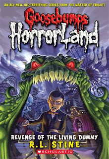
The first image I chose to analyze is a book cover from R.L. Stine’s Goosebumps HorrorLand Series: “Revenge of the Dummy". The creepy font that is used for the words “Goosebumps” and “HorrorLand” instantly conveys a lot of information to the viewer about the book they are seeing. The oozing, dripping title is reminiscent of blood, telling the viewer that the book falls into the horror genre. This imagery of blood is further developed by the red colour chosen for the word “Goosebumps”. To further this imagery, the texture of the font brings the words into the foreground of the picture, making it look as if the blood is on top of the page.

I feel that this font would really appeal to kids between the ages of 7 – 12 (the recommended age group for these books, and therefore, the target audience). Kids in this age group are very visual, and therefore, the oozing, creepy font on the cover of this book would attract them, and simultaneously tell them that the book is scary. This font is consistent throughout the entire Goosebumps series, conveying that each book within the series is also scary. Although I cannot give the proper name for this font, I can say that I have always referred to it as “The Goosebumps Font,” and have associated it with horror, creepiness, and danger ever since my childhood. The font used on the book covers for R.L. Stine’s “Goosebumps” series is very successful in attracting it’s target audience, and conveying information about the genre they belong to. I’ve always been told not to judge a book by its cover, but clearly you should.

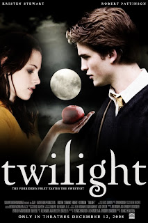
http://www.fanpop.com/spots/twilight-series/images/720496/title/movie-posters

The fancy serif almost calligraphic typeface used for this Twilight movie poster conveys a graceful, fancy, fantasy type of feel that works well with the story around which the movie was based. Twilight is a film depicting a romance between an ordinary girl named Bella, and the perfect Edward Cullen, who also happens to be a vampire. I feel that this movie was mainly targeted towards girls between the ages of 11 and 18, who were the main age group that the books, upon which this film was based, were target towards. I believe that the font used for the title “twilight” on this poster conveys the grace and beauty of both the character Edward Cullen, and the love story that takes place between the two characters. I would say that the white, loopy title also conveys a sort of dreamy, fantasy like feel that reflects the dreaminess of the storyline, and draws in the target audience. I also noticed that the title was written in all lowercase letters. I feel that this was done to further develop the graceful feel of the text, as lowercase letters are less bulky, and tend to flow nicer than uppercase letters.


The font that is used in the background of the album cover of this Austin Powers soundtrack conveys both information about Austin’s character, and the Austin Powers film itself. The typeface used for the words in the background of this cover was very common in the 60s, and is often associated with the hippie movement of that time. This font was chosen because the entire film is based around the humor of bringing a man from the 60’s into the modern day. The 60s vibe that this font gives off is also important in conveying the type of music that can be found on the actual CD, subtly informing the consumer of what they’re about to buy. The chubby font, varying in size and colour, is very lighthearted, fun, and “groovy,” much like Austin’s character, and the Austin Powers film itself. Although the majority of songs on this CD are from the 60s, I feel that the bright, colourful, and fun cover would attract the younger audience that the films also attract, introducing a new generation to the 60s decade and lifestyle.

Overall, it is quite clear to me now just how influential typography can be in a design. A typeface can communicate many things to a viewer, such as genre, mood, and cultural influence, while simultaneously attracting specific demographics. After observing typography used in a variety of successful ways, I now feel that the typography I choose for my poster design will play just as large of a role as the images I put into my design.

Sunday, September 27, 2009

Exploration of Colour

This week I decided to look further into how colours and colour schemes are used in the real world of design. I went over to HMV to check out some existing album covers, analyzing how colour is used within them, while seeking inspiration for my own album design. Once there I walked through the isles making note of every album cover that caught my eye. With this list in hand, I went home to look up the covers I wrote down. Taking a closer look into how colour schemes were used to create aesthetically pleasing, eye-catching designs, I discovered just how often the colour schemes we discussed in class were actually applied in the professional world of design.

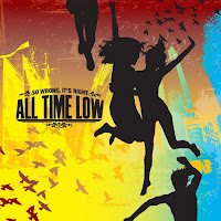
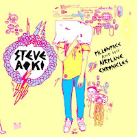
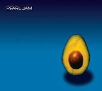
Triad colour schemes consist of three colours that are an equal distance from each other on the colour wheel. The most common triad I noticed while looking through the CDs that caught my eye were the primary colours (red, green, and blue). When together, I find the primary colours to be very bold and eye-catching, which is why I believe album covers such as: “So Wrong, It’s Right” by All Time Low, “Back to Bedlam” by James Blunt, “Pillowface and His Airplane Chronicles” by Steve Aoki, and “Pearl Jam” by Pearl Jam, were able to catch my eye; however the use of various tints and shades, along with differing amounts of each colour relative to each other produced differing tones and effects in each piece.The album “The People or the Gun” by Anti-Flag used two of the three primary colours (red and yellow) to create a very bold, in your face, eye catching design.

“So Wrong, It’s Right” by All Time Low


“Back to Bedlam” by James Blunt


“Pillowface and His Airplane Chronicles” by Steve Aoki


"Pearl Jam” by Pearl Jam


“The People or the Gun” by Anti-Flag


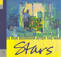
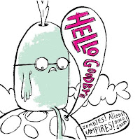
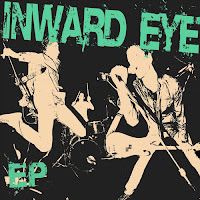
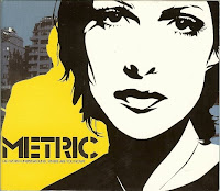
Similar to triad colours, complementary colours often seem to be utilized in album covers. Being opposite from each other on the colour wheel, complementary colours create contrast between each other, allowing the piece to stand out to the viewer. Albums such as “In Our Bedroom After The War” by Stars, “Zombies! Vampires! Aliens! Dinosaurs!” by HelloGoodbye, and “EP” by Inward Eye, are just a few examples of albums that use complementary colours on their covers. The Metric album “Old World Underground, Where Are You Now?” creates colour contrast on several levels by using the complimentary colours blue and yellow in the background of the album, while placing a black and white image above this. While the yellow and blue are contrasting each other, the colourless black and white image creates contrasts between it and the colourful background.

“In Our Bedroom After The War” by Stars

“Zombies! Vampires! Aliens! Dinosaurs!” by HelloGoodbye


“EP” by Inward Eye


“Old World Underground, Where Are You Now?” by Metric


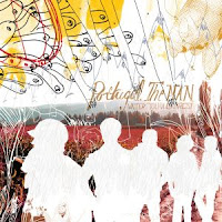
The albums “The Listening” by Lights, and “The Young Eyes EP” by Sara Lov use a type of colour scheme known as split-complementary. Similar to complementary colour schemes, split complementary drops one of the two complementary colours, and uses the colours adjacent to it instead. For example, the font on the Lights album is a yellow-orange colour, while the background is dark blue and various shades of purple. The Sara Lov album uses this colour technique as well, using hues of blue and green to contrast with the pink background.

“The Listening” by Lights

“The Young Eyes EP” by Sara Lov


Analogues colour combinations use three colours that are adjacent to each other on the colour wheel, and often tend to create very warm or cool tones. Colours such as red, yellow, and orange bring a very warm element into a work, while colours like blue, purple and green are cooler. “Love Drunk” by Boys Like Girls, “Appeal to Reason” by Rise Against, and “Waiter: You Vultures!” by Portugal The Man, are examples of albums that use warm analogues colours on their covers. While “Love Drunk” is exclusive to these colours, “Appeal to Reason” and “Waiter: You Vultures!” create contrast through the use of black, or small amounts of complementary colours.

“Love Drunk” by Boys Like Girls

“Appeal to Reason” by Rise Against


“Waiter: You Vultures!” by Portugal The Man


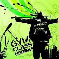
Monochromatic was probably the most common type of colour scheme among the CDs that caught my eye. Monochromatic colours only use various tints and shades of one colour, and are often contrasted by black and/or white. I feel that the contrast created between monochromatic colours tends to be subtler than the contrast created in complementary or triadic colour schemes, however I don’t feel that this makes the design any less eye catching. I personally find monochromatic colour schemes very aesthetically appealing. Albums: “Old Crows/Young Cardinals” by Alexisonfire, “This Is What The Edge Of Your Seat Was Made For” by Bring Me The Horizon, “The Papercut Chronicles” by Gym Class Heros, “Diva” by Sarah Brightman, and “Life Starts Now” by Three Days Grace, all use monochromatic colour schemes on their album covers in what I feel to be very visually pleasing ways.

“Old Crows/Young Cardinals” by Alexisonfire


“This Is What The Edge Of Your Seat Was Made For” by Bring Me The Horizon


“The Papercut Chronicles” by Gym Class Heros


“Diva” by Sarah Brightman


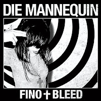
Sometimes colours were not present at all, and black and white images and fonts were used instead, creating vivid contrast between the two shades. “The Sound of Maddness” by Shinedown, and “Fino Bleed” by Die Mannequin, are two examples of albums with black and white covers.

“The Sound of Maddness” by Shinedow


“Fino Bleed” by Die Mannequin


Overall, I’ve discovered that there are many different ways that colours can be combined to create differing moods and effects in a design. The colour combinations that are used don’t exclusively determine the feel of a design, but rather a combination of the hues, value, intensity, and amount of one colour relative to the others all play a factor. Every design I analyzed was unique from each other, despite the fact that they were commonly grouped with albums that used the same types of colour schemes.

I sometimes found it difficult to classify which type of colour scheme an album cover belonged to, as every colour wheel I referred to seemed to differ from the last. Sometimes red’s complementary colour was green, while other times it was blue. This made it difficult for me to establish whether a complementary or split complementary colour scheme was being used, or hard to determine if a design was triadic. It was also sometimes tricky to tell if certain covers were using analogues or monochromatic colour schemes, as it was difficult to tell if various tints and shades, or a completely new hue was being used. I don’t think these details are extremely important however, as long as I have a general understanding of what colours look good together, and what effects different colour combinations have on a design when I’m designing my piece. I feel that finding the right colours for a design will come from a combination of this knowledge and some trial and error.