





The albums “The Listening” by Lights, and “The Young Eyes EP” by Sara Lov use a type of colour scheme known as split-complementary. Similar to complementary colour schemes, split complementary drops one of the two complementary colours, and uses the colours adjacent to it instead. For example, the font on the Lights album is a yellow-orange colour, while the background is dark blue and various shades of purple. The Sara Lov album uses this colour technique as well, using hues of blue and green to contrast with the pink background.
“The Listening” by Lights

“The Young Eyes EP” by Sara Lov

Analogues colour combinations use three colours that are adjacent to each other on the colour wheel, and often tend to create very warm or cool tones. Colours such as red, yellow, and orange bring a very warm element into a work, while colours like blue, purple and green are cooler. “Love Drunk” by Boys Like Girls, “Appeal to Reason” by Rise Against, and “Waiter: You Vultures!” by Portugal The Man, are examples of albums that use warm analogues colours on their covers. While “Love Drunk” is exclusive to these colours, “Appeal to Reason” and “Waiter: You Vultures!” create contrast through the use of black, or small amounts of complementary colours.
“Love Drunk” by Boys Like Girls


“Waiter: You Vultures!” by Portugal The Man

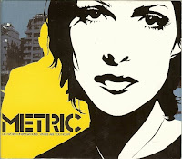
Monochromatic was probably the most common type of colour scheme among the CDs that caught my eye. Monochromatic colours only use various tints and shades of one colour, and are often contrasted by black and/or white. I feel that the contrast created between monochromatic colours tends to be subtler than the contrast created in complementary or triadic colour schemes, however I don’t feel that this makes the design any less eye catching. I personally find monochromatic colour schemes very aesthetically appealing. Albums: “Old Crows/Young Cardinals” by Alexisonfire, “This Is What The Edge Of Your Seat Was Made For” by Bring Me The Horizon, “The Papercut Chronicles” by Gym Class Heros, “Diva” by Sarah Brightman, and “Life Starts Now” by Three Days Grace, all use monochromatic colour schemes on their album covers in what I feel to be very visually pleasing ways.
“Old Crows/Young Cardinals” by Alexisonfire

“This Is What The Edge Of Your Seat Was Made For” by Bring Me The Horizon

“The Papercut Chronicles” by Gym Class Heros

“Diva” by Sarah Brightman

Sometimes colours were not present at all, and black and white images and fonts were used instead, creating vivid contrast between the two shades. “The Sound of Maddness” by Shinedown, and “Fino Bleed” by Die Mannequin, are two examples of albums with black and white covers.
“The Sound of Maddness” by Shinedow

“Fino Bleed” by Die Mannequin

Overall, I’ve discovered that there are many different ways that colours can be combined to create differing moods and effects in a design. The colour combinations that are used don’t exclusively determine the feel of a design, but rather a combination of the hues, value, intensity, and amount of one colour relative to the others all play a factor. Every design I analyzed was unique from each other, despite the fact that they were commonly grouped with albums that used the same types of colour schemes.
I sometimes found it difficult to classify which type of colour scheme an album cover belonged to, as every colour wheel I referred to seemed to differ from the last. Sometimes red’s complementary colour was green, while other times it was blue. This made it difficult for me to establish whether a complementary or split complementary colour scheme was being used, or hard to determine if a design was triadic. It was also sometimes tricky to tell if certain covers were using analogues or monochromatic colour schemes, as it was difficult to tell if various tints and shades, or a completely new hue was being used. I don’t think these details are extremely important however, as long as I have a general understanding of what colours look good together, and what effects different colour combinations have on a design when I’m designing my piece. I feel that finding the right colours for a design will come from a combination of this knowledge and some trial and error.

No comments:
Post a Comment