http://www.simplyfinedesign.com

The first good example of the CRAP principles I came across was this ad for “Simply Fine Design,” a web design company who clearly know what they’re doing. Contrast is created within this design through the use of colour and size. Because white is used as a backdrop to this piece, it is easy to create contrast between the images in the background and foreground. The black font that is used contrasts perfectly against the white background, while the orange and green within the font and the green within the apple contrast each other nicely. Various font sizes are used throughout the advertisement as well. The name of the company is much larger then the description of what the company does. This is because the company wants their name to stand out to the viewer, and also because the description is much longer than the title, and would clutter the poster if its font was too big. This variation in size catches the viewer’s eye, makes them focus on the company’s name, and keeps the piece from looking bland and boring.
The colours within this piece create repetition as well as contrast. The green colour of the apple can also be found within the ‘S’, ‘F’ and ‘i’ of the company’s title, as well as in the word “Design” at the top of the page. This repetition brings balance into the image, and encourages the viewer’s eye to move around the page.
The last two of the CRAP principles, proximity and alignment, are used to strategically space out the different elements of the poster, making the poster visually pleasing and not too cluttered. This is important not only because it keeps the overall image looking clean and tidy, but also because the company is called Simply Fine Design, emphasizing the importance of keeping a design simple, clean, and well organized.
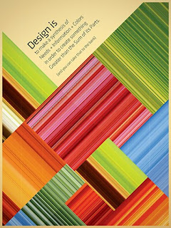
http://www.ttthings.com

The next image I decided to analyze was a poster made for a design competition, which I feel has expertly utilized the CRAP principles. Contrast has been created within this image in a variety of interesting ways. The colours within each box have been carefully chosen so that they contrast with the colours that surround them. Alternating horizontal and vertical lines are also used, further contrasting each box from one another while creating a repetition in pattern. While both the bright colours, and alternating lines within the boxes allow each box to stand out against the other, the greatest contrast that is created in this piece is between the bright, colourful, and busy boxes, and the solid beige area at the top of the page. The dull, solid, light beige colour allows this area to stand out from the rest of the vivid poster, while creating contrast between it and the dark font that is placed upon it.
The font at the top of the page is tilted rather then horizontal to match the slant that the boxes are on. The placement of the font in this way makes the design more dynamic and interesting to look at, while the repetition of these angles throughout the poster encourage the viewer to move their eye around the page, and keep the poster looking neat and tidy. I believe that the beige section is placed at the top of the page because the busy, vivid boxes appear to be heavier then the beige area, making it natural to place the lighter, less dense section above them.
http://www.35mmdesign.com

The third image I chose to analyze was a poster made for what I presume to be a concert. Although this poster is monochromatic, contrast is created between the light and dark yellows being used. The two images within the poster contrast as well. While the top image of the skull is an outline, the image at the bottom of the page is a solid silhouette. Once again differing font sizes keep the design interesting and draw attention to the name being emphasized, while light yellow lines in the background of the poster, consistent font, and the mirrored title add repetition to the piece. The images and font within the poster are well spaced and organized, keeping the poster from looking too cluttered and busy, and making the overall image appear balanced and visually pleasing.
http://www.anna-om-line.com

The final image I chose to observe came from Anna-Om-Line, a website that showcases the digital media of artist Anna Lopez. The image I chose uses contrast, repetition, alignment, and placement successfully to create an aesthetically pleasing design. I feel that the most prominent contrast within the image is between the solid and vivid colours that are used, and the grayscale graded images. Contrast also exists between the realistic, organic images of the three people and the elephant, and the cartoonish, geometric images of the stars, hearts, and butterflies.
Colour and shape are used in a way that creates repetition within the piece. The same colours are use throughout the image and are always placed in the same order relative to one another. Repetition in shape can be found throughout the poster in the form of stars and circles.
The page has been organized in a way that has placed the majority of the grayscale images towards the bottom half of the page, while the colourful images remain above. There is a large amount of overlap of the gray and colourful images at the center of the page, however the most noticeable contrast is created by the black deer silhouette further up the page, and the red heart surrounded my the colorless face.
The postcard we created in the digital media lab this week can also be said to demonstrate the CRAP principles of design. Contrast is created between the dark night sky and the bright neon lights of the buildings, the “Welcome to Los Vegas” Sign, and the bright images placed at the top of the page. Repetition is created using the neon sign in the bottom right corner, keeping the neon look consistent throughout the postcard, while the alignment of the logo at the bottom right of the card successfully makes overall image more visually appealing. Finally, the placement of the neon “Welcome to Las Vegas” sign, and the bright images at the top of the postcard bring balance to the design, and encourage the eye to move around the page.
After analyzing the use of the CRAP principles within various works of digital media, I have found that these simple rules of design truly are applied to many successful works. I feel that the CRAP principles provide excellent guidelines for inexperienced designers such as myself, helping me to organize my work in aesthetically pleasing ways. Even though these guidelines provide excellent tips for creating successful images, I feel that a designer must also consider the messages and feelings they want their images to convey, and use their artistic license to achieve these. The artist should not solely rely on the CRAP principles, but rather should use them as general guidelines they can follow when designing a work of digital media.

No comments:
Post a Comment